Improving usability of a Mobile tax refund feature
Generating intuitive user flows that build trust & transparency.
Global Blue helps enhance the shopping experience and boosts retailer performance through technology & services like Tax-Free Shopping, providing travellers with hassle-free ways to claim back VAT on their purchases abroad.
The Challenge
As part of the Mobile - Consumer Engagement Solutions team, we were tasked with assessing the usability of the Mobile Customer Care feature (MCC) to make the digital tax refund process more intuitive and user-friendly for international travellers when shopping abroad.
My Role
Co-led user research process to identify usability issues & gather feedback to refine the tax refund process in the MCC feature.
Conducted Journey Mapping Workshops collaborating with PMs UX Designers & Marketing teams to derive insights on tax solutions
Gathered feedback, identified pain points, & opportunities for design iterations to simplify the user experience for customers
What was the impact?
30% reduction in task abandonment rate and time on task by improving screen optimization.
42% increase in feature usage and frequency of use by users.
So what is a Tax Refund?
When tourists shop in countries with value-added tax (VAT), they are often eligible for a refund of tax paid on their shopping purchases as they are not residents of the country.
Where does the Problem lie?
However, the refund process can be complex, involving multiple steps like obtaining receipts, filling out forms, and dealing with customs at the airport.
Many travellers face challenges when navigating tax refund processes physically and digitally, leading to frustration and dissatisfaction.
Traditional method to validate and obtain Tax refund when travelling
What does Mobile Customer do?
Provides step-by-step guidance to track and manage tax refunds
1.
Checks for for live updates when your refund status changes
2.
Finds the nearest Refund Office for you.
3.
Lets user add payment details to get refund paid automatically,
4.
Basically, automates and simplifies the Tax Free-form refund process within your smartphone.
What did I do?
I identified where and why usability issues occurred that disrupted the refund workflow process of users to understand why they churned through moderated in-person usability testing sessions.
I drew areas for Visual and Copy improvement, based on real user feedback.
The goal was to develop the product to be intuitive, efficient, and meet the needs and expectations of diverse users.
Specific objectives included:
Understanding user behaviours and expectations around Tax processes.
Identifying pain points and barriers to usability within user flows.
Ensuring the platform aligns with users' needs and expectations.
A deep-dive into Testing
We used People for Research to recruit both experienced tax reclaimers and those new to the process to receive valuable feedback about their tax refund experience.
Participants were instructed to use the mobile version of the Global Blue prototype to reclaim tax on their international purchases.
4 different scenarios were presented to explore different interactions within the MCC version such as initiating a tax refund claim, tracking refund status, and validating tax.
12
Total number of participants
7
Have claimed tax before
5
Never claimed tax
3 rounds of usability testing (4 users per round)
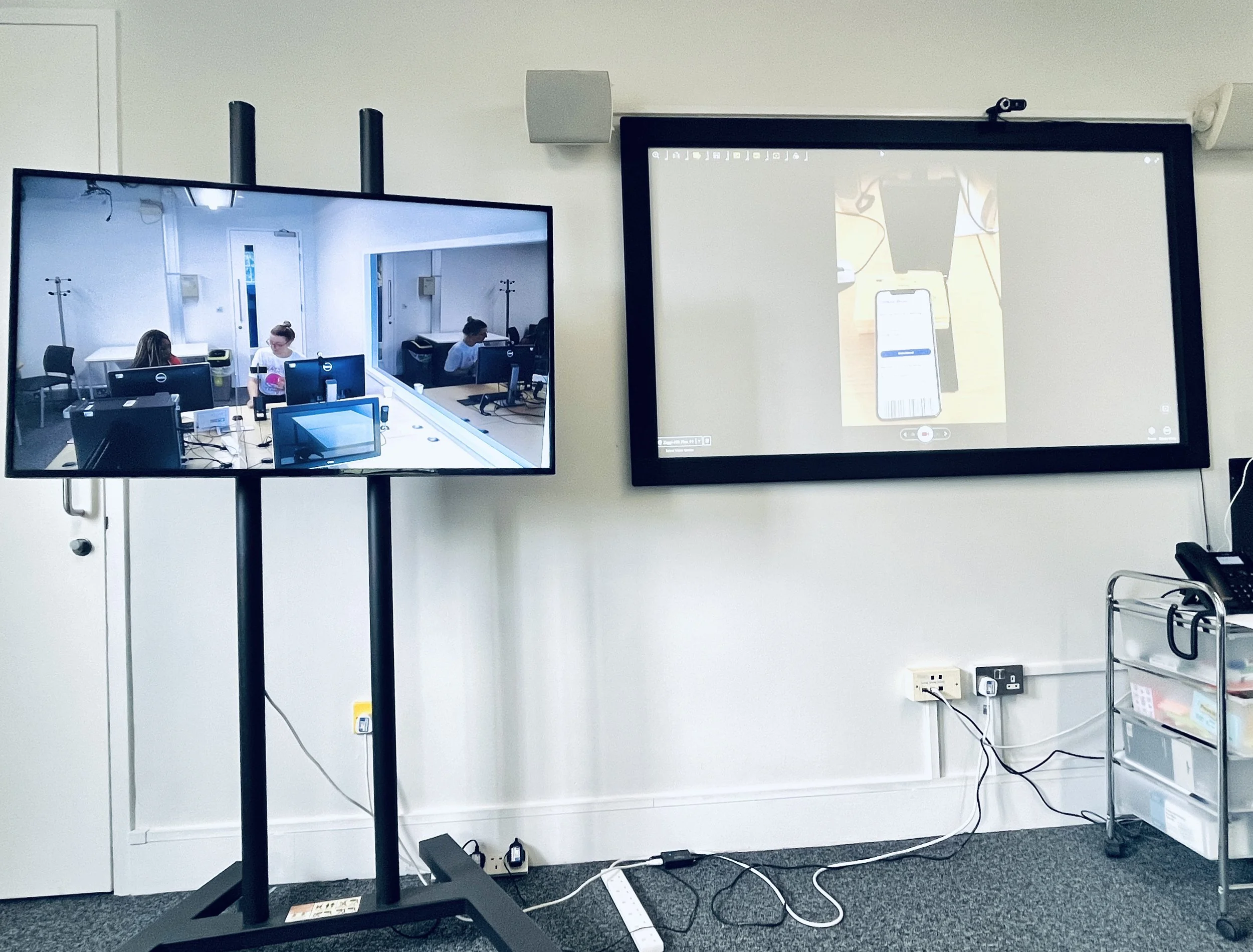
Snippet of an ongoing in-lab usability testing session
Including both experienced and novice users helped identify common challenges and areas for improvement, providing detailed insights into the service's usability and enhancing the overall user experience.
User Interviews
Problem discovery interviews were conducted with the users to learn about their frequency of travelling and shopping abroad, their experience with tax refunds, identify potential opportunities and learn about their compliance requirements.
A Specific script was prepared to address all the flows to be tested with drafted secenarios.
Usability Testing
Following interviews, Testing Sessions were conducted and recorded using MORAE to gather well-rounded insights.
Scripts for user interviews
User Journey Mapping Workshops
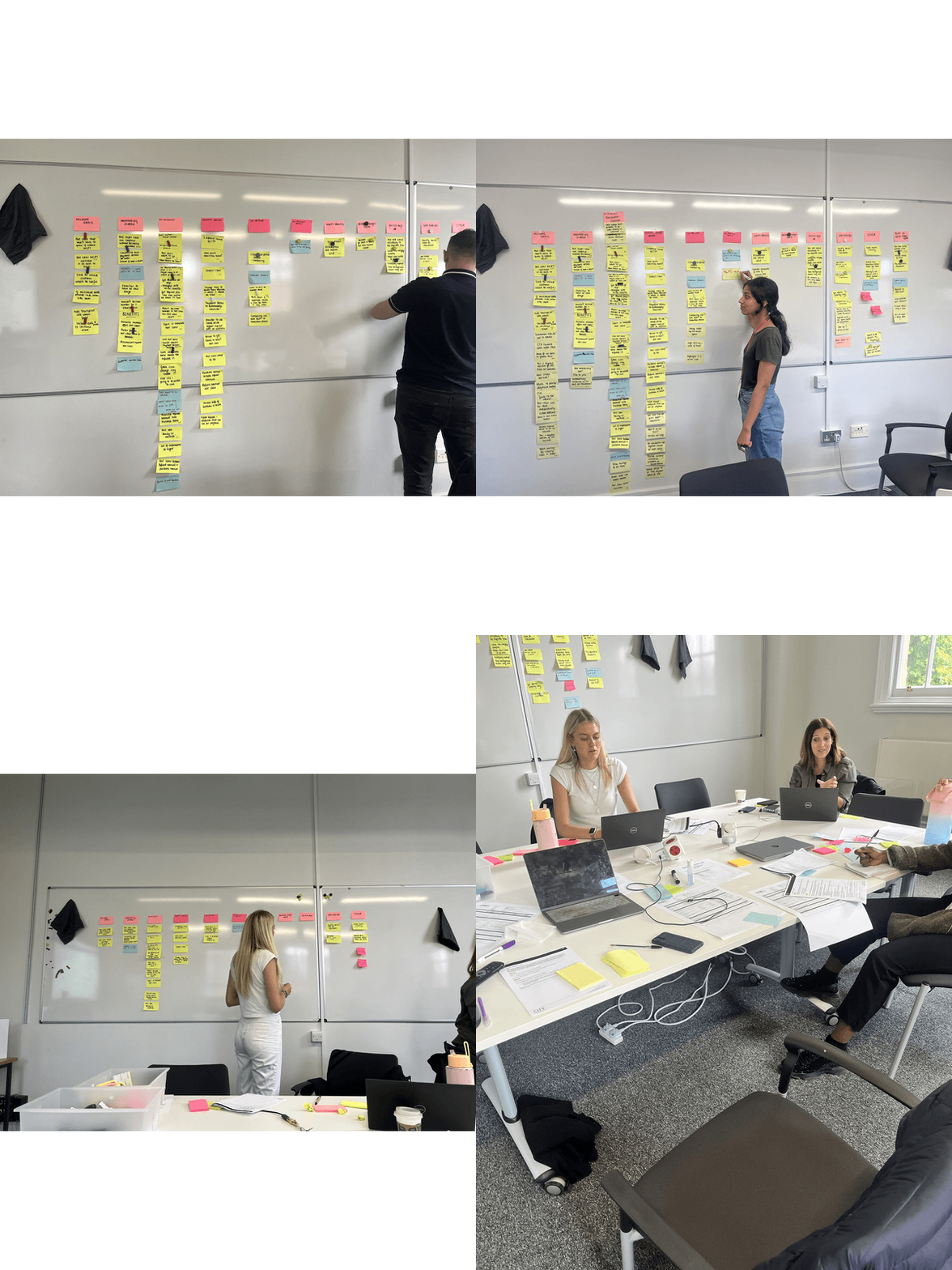
After gathering the initial insights, we held a User Journey Mapping workshop with my team to identify persona, goals, scenarios, and steps for users reclaiming tax on their purchases. The workshop helped visualize the customer journey process.
Customer Journey Segments, devised by us
The outcome of the workshops was identifying opportunities, which helped determine how user experience could be optimized as well as deriving insights about tax solutions.
"What needs to be done? Where are the biggest opportunities? How do we integrate trust?"
The workshop was a highlight for redesigning the product and benefited the team in having conversations and aligning the team's mental model.
What did we find out?
Identified opportunities we found:
Users could do with some sort of guidance when it comes to claiming tax refunds.
Digital tax refunds would be very convenient for users to claim if they were provided with fundamental and accurate information in all their correspondences.
Design audit on the Email
Design audit on Purchases
Design audit on Transactions
Working out Solutions
With the necessary foundations, knowledge, and preparation in place, we targeted specific aspects. that needed to be reworked. The design aimed to improve content & action clarity and show better visibility of system status, prioritizing user-centricity, along with easy error recognition and recovery.
1. Content Redesign - Added details to guide users through the whole refund process
Edited UX Copy to add specific information within the email.
Why did the customer receive the email?
Where should the customer go?
Explained where and when payment details were needed.
Which step of the process required it?
Rearranged Transaction details in chronological order of steps to be taken to validate Tax-Free Forms.
2. Clarity in labels & visuals - CTA buttons and Refund data
Relabelled Get Refund → Add Payment details
Added country flags in each transaction to show where the purchases were made at first glance.
Made Refund Amount more prominent for user to view.
Reworked icons & visuals to accurately reflect status
3. Visualising current status and change in status.
Added total amount saved and currency to view it.
Visible icon change when NCPT was added.
Relabelled CTA to reflect the accurate action
Showed status change when details were updated
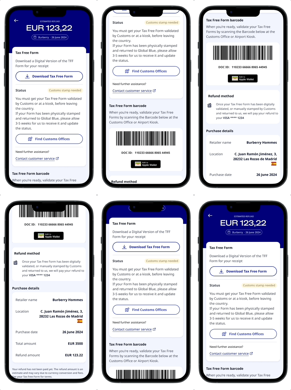
Prototype of the refined MVP flow
Identifying Outcomes and Impact
The main learnings from this project were that tax reclamation processes needed to be straightforward, clear & intuitive for the user if they needed to feel comfortable and adopt digital tax reclaiming in the future.
Clearer Instructions from the get-go - Helped users understand why they were being contacted and what exactly they needed to do
Section layout reflecting chronological order of tasks to do - Guided users through a step-by-step process avoiding confusion
Clarity in CTA and Icons - Visibility of current status and exact action to do provided certainty
Testing the outcome of our fixes:
35 second
reduction in task-completion-time by eliminating misleading labels
42%
Increase in user satisfaction by improving status change visualization


