Redesigned the digital vision for Ovo Natural in the face of a pandemic
Ovo Natural was conceived during the pandemic as an alternative to otherwise alcoholic sanitisers and disinfectants that had the potential to turn harmful for consumers.
As a product designer, I was brought on board to visualise the identity of the brand to help grow with the times; and create an end-to-end digital presence online for the brand to successfully market and sell disinfectant products from B2B base to a B2C base.
I collaborated with the UX lead, visual design, production team, and business development teams to refine design decisions.
-
I created a cohesive visual language across the site, oversaw responsive design across different breakpoints to maximize user engagement
-
Visual Design, UI/UX Design, UX Writing, Visual Identity, Product & Market Strategy
-
Figma, Adobe Photoshop, Adobe Illustrator
-
6 months (2021)
-
1x PMO
1x Design Lead
1x Designer
Problem
The current site has an abundance of content that is challenging to locate. Bits and pieces of information are scattered without a clear path for discovery, making it difficult for customers to browse through the site to find relevant information
Content modules lack scalability, posing challenges to updating the information quickly and regularly, as well as accessing them from various device sizes
Does not have a provision for customers to purchase directly from the website.
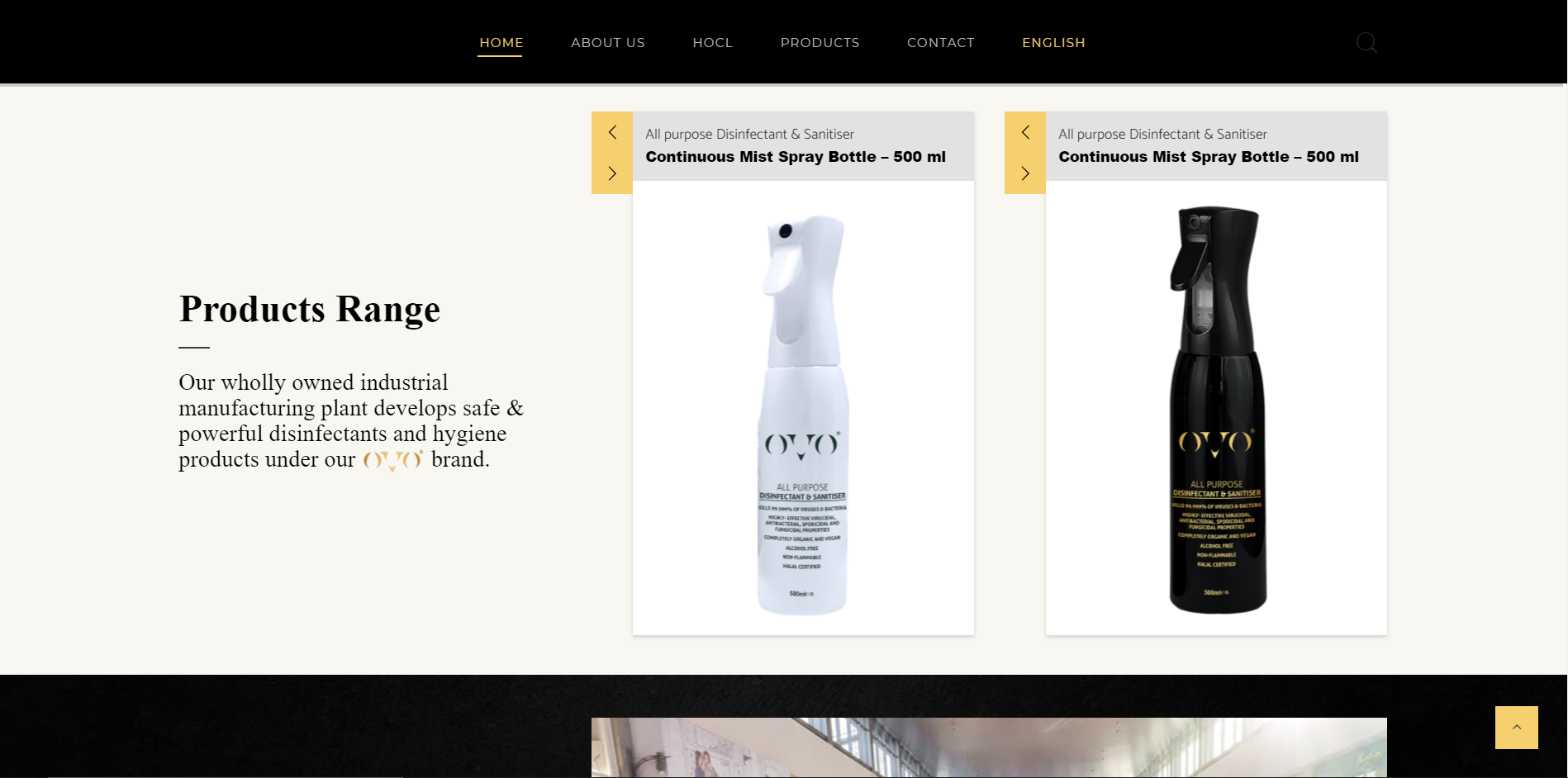
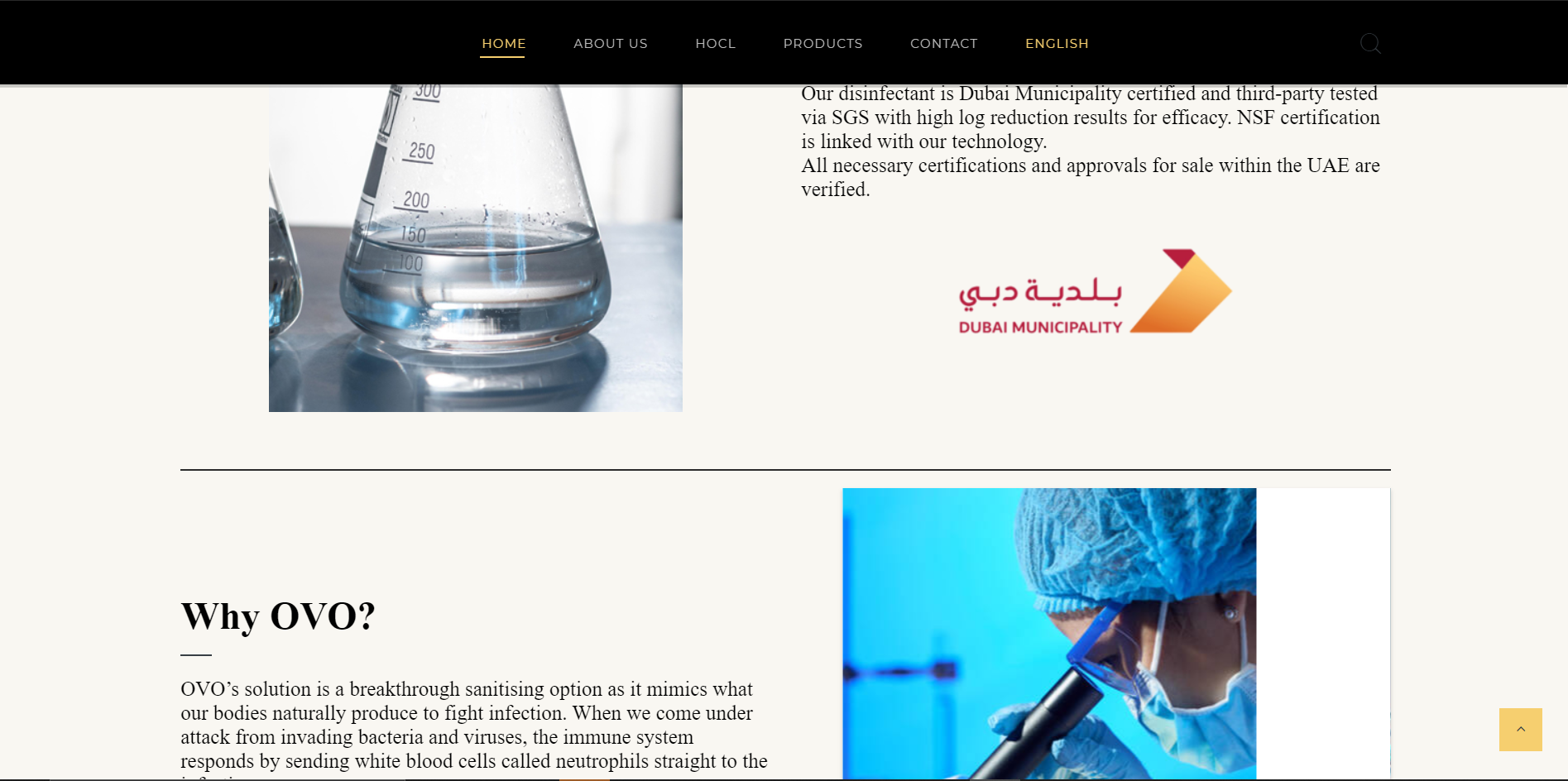
Existing Site Design and Layout
Our work started with observing the users and current market strategies, followed by preliminary brand work. I familiarised myself with understanding Ovo’s existing current services, manufacturing process, and the current digital website.
Contextual Research
Understanding Users and Products - familiarized ourselves with Ovo Natural's’s existing B2B services & client market.
Performing a Competitor analysis - identified top market competitors and assessed their strategies to know their value propositions and how well were their services designed and products integrated with UX to serve customers directly.
Screenshot of the competitor analysis matrix for UX features and services of the competitors.
Goals for the Redesign
To effectively launch as a Business-to-customer brand, we curated a list of features and products that we had to focus on looking out for any visual design shortcomings.
Viewing relevant products in different categories with direct e-commerce
An FAQ section to address common queries that would reduce repetitive customer inquiries.
Easy account creation for repeat customers to store data of delivery information and repeat orders.
Redesigning the Brand identity & Visuals
We recreated the identity by defining what our brand represented:- Natural, Non- Toxic and Safe for the Environment which is how we wanted the consumers to see our products.
I worked with the lead designer to redesign clean, sustainable packaging for the different array of products (both physical and digital) to better align with the brand values and to serve new and existing customers across various sectors.
After designing the brand, I collated guidelines for our online presence and worked on social media assets for our handles on LinkedIn and Instagram. This also included creator content and designs for Instagram Ads.
Revamping digital presence
01
Delightful Visual Language
We rebuilt OVO Natural’s digital service to align with the brand's core values of natural, organic, and clean living.
The redesign process was done following a minimalist and nature-inspired design after deep diving into the brand's ethos. Natural tones, crisp imagery, and a clean layout were adopted to promote a sense of purity and organic lifestyle, effectively communicating the essence of OVO Natural's offerings.
02
Streamlining e-commerce flow
In order to launch the products and services to general public, the focus was to ensure a seamless experience while purchasing the product which would be quick and transparent.
I took primary ownership of the critical e-commerce user flow. I refined user journeys and created, wireframes and user interface documentation outlining screen relationships.
Revised journey map of purchasing a product from the Ovo Natural Store
Prototyped flow of purchasing a product from the Ovo Natural Store
03
Streamlining Design-to-production Workflow
I crafted a well-defined visual language to enhance the perceived quality of the brand by creating a design system to reduce redundancy while ensuring consistency of visual elements like colour, typography, spacing, and imagery across product teams.
This involved optimising colour accessibility and component uniformity to manage design at scale.
Assessing Impact of the Redesign
We evaluated our designs through user surveys and feedback loops. The results were:
80 %
User satisfaction with the new design by eliminating extra information and restructuring site architecture
15 %
Increase in Brand Reach with SEO
40 %
Increase in orders purchased directly from the website
An overwhelming 80% of users enthusiastically confirmed that the revamped purchasing experience significantly enhanced efficiency.
Reflections
Efficacy of good practices during market research and product strategy is inevitable to successfully ship a product to customers. This helped to understand how different business were structured while reaching customers directly with their products or services.
Often it is not about how the user experience is designed, but how the complete service is designed that can make or break a product.
Despite the inevitable challenges that arose, open communication and coordination gave way to collective problem-solving skills and ability to adapt to changing circumstances


